

FreshCart
Quick ordering for busy hospitality teams
Mini feature exploration for a B2B food procurement app

Role: UI/UX Designer
Timeline: 1 1 weeks
Tool: Figma, AI tools
Overview
FreshCart is a mobile concept for B2B food procurement, designed for cafés, restaurants, and hotel kitchens that place frequent repeat orders. This mini case study focuses on the Quick Order component on the home screen, which surfaces everyday essentials, shows live stock status, and lets managers adjust quantities inline.
Instead of rebuilding the same basket through multiple product pages, Quick Order aims to turn the home screen into a fast daily control panel for confirming today’s items, spend, and order in just a few taps.
Define Problems
Cafés, restaurants and hotel kitchens place almost the same orders every day, but most grocery-style apps don’t support that workflow well.
Rebuilding the same basket every day
Managers must repeatedly search, open product pages, and add items one by one, which is slow for daily repeat orders.
No single view of key items and stock
Essential products and their availability are scattered across different screens, making it hard to quickly confirm what is in stock for today.
Too many steps during busy periods
Morning prep and between-service windows are short, and a long multi-step checkout flow increases cognitive load and the risk of missing important items.
Limited visibility of today’s spend
The running total is only clear near the end of the checkout process, making it harder for managers to control budget while they are still adjusting quantities.
Ideas & Goals
The Quick Order component is designed to better match the daily workflow of hospitality managers. The goals were to:
Reduce steps needed to repeat common orders by keeping everyday items on the home screen.
Provide a single view of key products, stock status, quantities, and today’s estimated spend.
Support inline editing so quantities can be adjusted without opening individual product pages.
Enable a fast checkout path “Order now” for busy periods when managers only need to confirm and send today’s order.
Who are the users?

Primary user
Site worker
Site Snap is designed first for the people who are physically on site every day. They need to get through check-in, induction, tasks and reporting while wearing PPE, under time pressure, and often with limited attention.

Secondary user
Site manager
Needs a reliable view of who is on site, what has been completed with photo evidence, and what hazards have been reported, without interrupting workers constantly.
Starting the day
Arriving at the gate, scanning a QR code to check in, and confirming that today’s induction and PPE are complete before starting work.
Monitoring who is on site
Checking real-time attendance to see which workers are currently signed in and where they are assigned.
Completing today’s tasks
Opening the app to see today’s tasks, quickly spotting which ones need photo evidence, and uploading clear images as proof of completion.
Reviewing safety and work quality
Browsing photo-backed task completions and new hazard reports to decide what needs follow-up or escalation.
Home & product screens
UI design

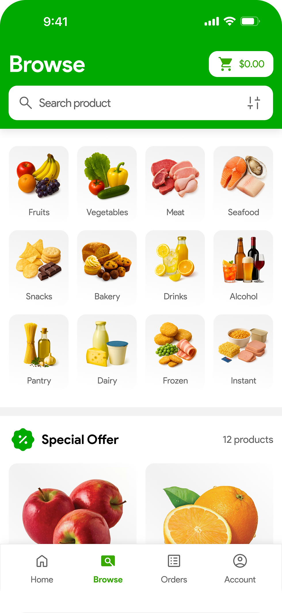
Home screen
Daily start point for ordering – location, search, cart and Quick Order are all on one clean screen. Big cards、strong green accents and lots of white space keep it easy to scan.
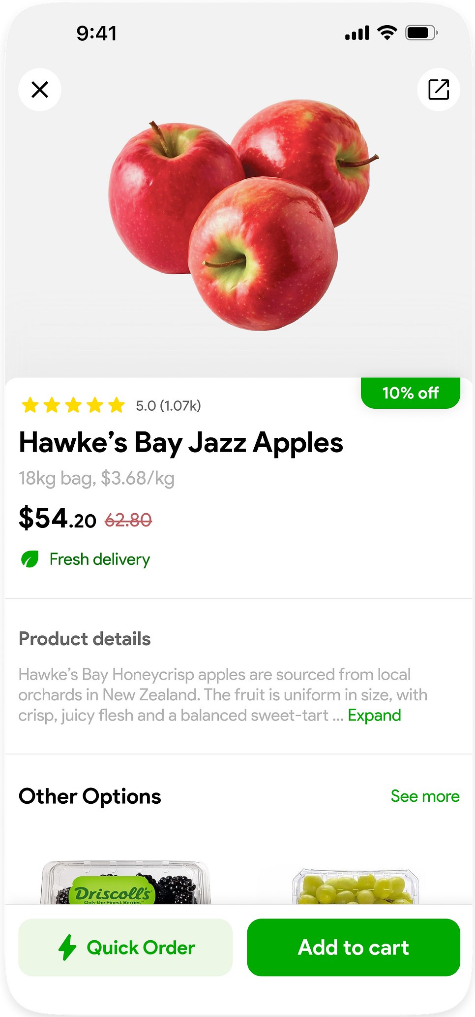
Product detail
Simple product page to confirm price and freshness. Large photo on top, tidy text blocks underneath, nothing extra on the screen.
-Quick Order component


Quick Order
A strip on the home screen for the usual items. Managers change quantities with “– / +” and see the total in the same place, with just two main buttons at the bottom.
Out-of-stock state
If an item isn’t available, its card turns into an “Out of stock” state with a small link to other options, keeping the row neat but still clear.
Browse page UI design

Onboarding & Log in UI design


UI Components
Color System
Brand / primary color
00AA00
007C00
ECF7E6
Neutral / Background
000000
666666
F2F2F2
FFFFFF
Semantic
C26365
FEDA00
Typography
Font:
Product Sans
Sizes:
H1: 32 pt - Bold
H2 24 pt - Bold
H3: 18 pt - Bold
Body 1: 16 - Bold
Body 2: 16 pt - 16 Regular
Body 3: 14 pt - Regular
Label 1: 12 pt - Bold
Label 2: 12 pt - Regular
Radius & Elevation
Cards —12 pt
Buttons — 12 pt
Buttons small — 12 pt
Shadow / Elevation
Y: 4
Blur: 10
Color: 12% #000000
Layout & Grid
Reference device: iPhone, width 390 pt
Content horizontal margin: 12 pt on both left and right sides
Tile vertical padding: 12 or 24 pt inside each tile (top and bottom)
Spacing
4 pt:
Micro spacing between icons and text, and inside labels.
12 pt:
Vertical spacing between form rows and between content blocks inside cards.
24 pt:
Vertical spacing between major sections/modules on a page.
Icon& size
Regular: 24 pt
Outcome & Next step
The Quick Order mini project focuses on keeping the home screen centred around one clear job: helping managers complete today’s order as quickly as possible. The UI is intentionally clean and spacious, so most actions happen on a few large cards and two primary buttons, turning Quick Order into a shortcut for high-frequency, time-pressured reordering instead of a long supermarket-style flow.
Next steps for this feature could include adding different Quick Order sets for weekday and weekend menus, showing simple spend and volume trends to support planning, and connecting with inventory data so suggested quantities update based on what is already in stock.